here's how I got started...

here's how I got started...
a 20 minute podcast by Crazy BeYOUtiful

Friday, March 4, 2016

from black to white...

let's start with a shipping update...
GOOD NEWS!

my stampers anonymous products
 are shipping NOW to stores, so if you preordered stamp sets, stencils, 
they will be arriving any day!

today I thought I'd share another way 
to use a solid image stamp & 
to show what a difference you get going from a black to a white focal point...

I'm using the bird/branch from


here is the image stamped in jet black...
you could quit there & it looks good...
but...
 with "the bird on a branch SiSi", I could add embossing powder to just the bird to accent him...
the stencil allows the background to be protected & the embossing powder adheres only to the bird...
here's how...
just place the stencil over the stamped image, add archival ink & the coordinating embossing powder...
this guy is done with custom brick embossing powder...

the SiSi stamp is the outline of the bird/branch, so they work well together or alone...


I flippin' LOVE the 


and here is the same image again...
this time on
 the distress crayon background...

you can read 
about the distress crayon background


then I wondered what this image would look like stamped & embossed with white...

below is my super quick test drive card...

the base is mixed media cardstock...
I stamped the bird/branch with 
embossed it with 
I filled in the background with weathered wood & brushed corduroy distress spray stains...

the embossing protects the image & the distress inks do all the work...

working under the bird, I added water first,  then dropped the brushed corduroy into the water, close to the bird, to keep the darkness there...

you can see some photos in this post...
you'll see the water being added & the stains being dropped in...

while that was still wet, I added water around  the remaining portion of the bird, 
then dropped in weathered wood stain & let the magic happen...

when the stains were dry, you'll see I added some stenciling in the background...
that was added with the old ledger stencil, 

BUT...

you could stencil first, if you used archival, then add the distress as a watercolor...
DRY archival ink is waterproof...

I flicked some brushed corduroy distress stain over the card...
I love the detailer water brush for that...

I tossed this in the trash...
it was meant just for a test to see if I liked it, 
then I got it out to show you...
oh...what the heck...be brave...
it's nothing fancy, 
but it might inspire you to
play...

the sentiment was stamped with  jet black & I used a waterproof pen to draw a very loose "frame" around the ink...

was added & that's it...
put it on a thin brown cardstock & then on a mixed media card...


I L O V E how the colors blend...
keep that in mind when choosing your colors...
this is a gorgeous combo...


I think this is another example of how versatile stamps are & how a simple change of color really makes a big impact...

 try this once  & you'll see it's a very easy simple card...
if you need to create a last minute card, 
this is it...

have a GREAT weekend...

I hope you'll grab your stamps &

MAKE ART!
wendy


Tuesday, March 1, 2016

combining old & new with a TWIST...

 in an earlier post I shared that I've been using my archival reinkers to make archival sprays...
yesterday I added leaf green to the mix...


I filled the mister about 75% full of rubbing alcohol, then added about 
now I have a leaf green spray!

I kept this spray fairly light, but you can vary the color to your liking...

for this card, I started with a 
it's cut to 3 ½ x 4 ¼...

I misted it lightly with leaf green & sky blue
then I dried it...

I stamped the sentiment at the bottom, 

here's where it started...


I had an idea that I wanted to make a bouquet with the leaves from this stencil, but the stems weren't long enough...

so you'll see that I masked off the center portion with a tiny bit of masking tape...
washi tape would work just fine too...

I wanted it to look like I used 3 different stencils, so you'll see that I also masked off the lower 2 leaves on the left...


 turn the stencil over & check to make sure that the tape isn't blocking any portion of the open areas...


then stencil with leaf green archival...


the background gets another layer with 
after it was inked with sky blue...

when stamping random areas in the background, I like to use the stamp UNmounted for better placement control...


here's a little tip to prevent stamping an image upside down...
just use a Sharpie to add an arrow right on the cling...

I know that the arrow pointing up means right side up to me...


now there's subtle & random text in the background...
I like it...


I L O V E this 
the most!

I like that there are several ways to use it & that I can use just portions of it too...

I had a scrap of clearly for art (aka CFA) that was covered with newsprint paper...

I inked the flower portion of the stamp with jet black & stamped just the large flower...

and cut it out...


I used sunflower to ink over the whole flower & gave it a quick dry...

the new distress crayons are great for adding shading over dry archival ink...

I like to use the moist detailer water brush and touch it to the tip of the crayon...
then just paint the area that I want to shade...

you'll see that at the end of the post...


now if you refer back to the title, 
TWIST is the key word...

I used sky blue to stencil the vintage quilt stencil over the card...
oops no photo...
I got excited...

I had an idea that I wanted to add another color to the stencil, to make it stand out a bit more...

the photo below shows that I cut a piece of clearly for art to 2 x 3 inches & used a 1/8th inch hole punch, toward the center of the piece...
mine is really old...but I found this one...

this size CFA was perfect, because now I can place the HOLE over the + stencil & add another ink color!


make sure that your CFA piece is large enough, so that you can use the mini blending tool & not worry about going off the edge with ink...
this makes it super quick...

you could also use stencil material or a sturdy plastic...

I like it to be clear, because then it's simple to position it exactly in the center of each +...

like this...


I added a dot to each + with fern green, using my new single dot stencil...
it totally changes up the vintage quilt stencil & makes it even more fun!

see the difference that little dot makes?
what took me so long to think of this?

I also stamped a flourish, using jet black...


now to remove some ink from the background...
my distress sprayer has alcohol in it...
and I have a clean foam on the blending tool...

I misted some alcohol onto the craft sheet & picked it up with the blending tool...
don't oversaturate the foam...
it just needs to be moist...
NOT soaking wet...

now I can rub away some background color, using the lots of dots stencil...

one advantage of a clean stencil is that you can see exactly where you're removing the color & avoid the leaves or your main image...


this next photo shows the results...
they're subtle dots, 
but it's another layer in the background...

I used the peeled paint marker to draw in some long stems...


and here's my finished card...
the flower is raised with black foam adhesive & I added these dots with 

the bow was also stamped on a small scrap of  CFA/newsprint paper , inked with sunflower & then stenciled with red geranium archival ink & the new lots of dots stencil...


here's a better shot showing the shading on the flower...
archival inks and
work well together...

it's PERFECT for attaching the little bow...


can you see that
one little dot sure can make a big impact?
it freshens up the vintage quilt stencil & it takes very little time...

other ideas are brewing...

I can't wait to add the dot with embossing paste to create a raised center...
it could be translucent paste for a shiny clear dot or gold or silver paste for a really cool metallic accent...

or...
how about using a colored embossing powder after stenciling the whole stencil...
melt the powder...
then go back & add a center dot in a coordinating archival color or embossing paste?

it's so much fun to...

make art!
wendy


Tuesday, February 23, 2016

archival ink with...


this is the 3rd post in the series,
 that shows several ways
 to use the same stamp... 

you'll find #1 here...
that showed
watercoloring with distress stain...

and #2 here...
that was about
watercoloring with archival inks...
both with the same stamp for different results...

I got hooked on the weathered white
because it's a very textured, gritty, matte finish embossing powder...
it actually feels like sandpaper after it's melted...

it's great for backgrounds...
and
I really like it for doilies & lacy borders...

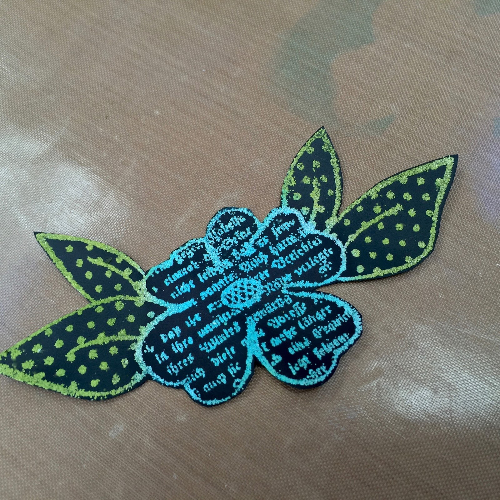
this page in my new fat little book, shows the vintage doily background stamp, inked with glacier white pigment ink, then embossed with weathered white embossing powder...

you can click the photo to see the texture better...

I inked over the cooled embossing powder very lightly with a bit of potting soil archival ink to age it...


in the photo below, 
I used weathered white again with
I think it really looks great

the hearts are the new mat mini "have a heart"...
I use them for so many projects...

the flower is from this stamp-it stencil-it...
(bottom middle) & it's inked with 
 the cute gal is cut from a 


here's the same lace border again, this time it's lightly inked with tree branch archival, to create the vintage effect...

see that beautiful flower color?
delicious!

the flower is popped into the
it's cut from 
to jazz up the cup/saucer...

you'll find the mat mini heart here...

that's stamped on a white mat board scrap & cut out...

the sentiment is from

and the spoon is a perfect fit for
 the adorable tea cup...

oh...
 the flower center is a new mat mini button, accented with some black glaze pen dots & some tan-ish embroidery floss...


I demoed this weathered white embossing powder/archival ink technique @ CHA & here's a video compliments of Melody Lane...
if you click the link
in the video  you'll see the technique used with

I think bolder images work best...
fine lined images don't show up as well...

this technique only works on black, because archival are translucent inks & they won't show up on a black surface...
this technique will not work on a light surface, UNLESS you are using a stamp-it stencil it...
that's another way to use the stamp-it stencil-its...
I'll be showing that soon...
it's flipping' COOL...

this card starts off the same as 
in the previous 2 posts...
 I inked the same stamp with glacier white pigment ink & added weathered white embossing powder...

my base is Ranger's black cardstock...

I'll trim this base down later, 
when I figure out what I'm doing...


I decided on these 2 archival inks...

leaf green for the leaves & 
 for the flower...

choose any archival colors you like & they will work & look great...


here's the leaf green added with the blending tool...
I find it best to tap the inked blending tool over the embossing powder, as opposed to rubbing over a large area...

you do see a tiny bit of wetness, where the ink is on the black background,
 but that will dry & disappear...


next, I inked the flower...

you can see that the area around the leaves is already drying...

give it a quick dry & you'll see that the archival tints the embossing powder...
and...
the black background shows no color...


I wanted to add dimension to this card, so I used my clearly for art BLACKOUT...
it works the same as the clear CFA...
just use the Ranger heat-it tool to soften the material, then shape & it stays put...

since the "blackout" is a plastic-ish surface, I did prep it with the antistatic powder tool, to prevent stray embossing powder from sticking everywhere...

here are the 2 CFA blackout pieces cut out & ready to be the top layer...

I ended up not using the top one...
but I'll have it ready for another day...


back to the original black cardstock piece...
I trimmed around the leaves for something a little different...
they're hanging off the base...


I added a piece of black foam adhesive under the CFA blackout piece...
 I LOVE this stuff...LOTS &
 it's perfect for 
clearly for art...
you get perfect dimension & great adhesion...


here's my card layers...
the largest was stamped with 
the top layer is sunflower again, stenciled thru the new "lots of dots" stencil...
I didn't worry about the center, since it would be covered...
and the middle is black cardstock...


and here's the finished layered card...

the sentiment is stamped with jet black archival...

the flower center is tim's new hex fastener inserted into a fluted fastener...

I offset the top layer just a tiny bit so that the bottom flower/leaves layer would peek thru...


so that's post #3...
showing several ways to use the same stamp...

I hope you've enjoyed it...

I'm not sure what's next...
stay tuned!
would you like another series like this?

today I have a CHRISTMAS assignment that needs to get done...
yikes!

I  hope you can see how cool 
the weathered white embossing powder is, especially when it's tinted with archival colors...
it's super easy, it's another way to use your archival inks & it adds really nice texture when you...

make art!
wendy


Friday, February 19, 2016

archival ink watercoloring...


here's part 2 of this series...

showing how to use a stamp, 
several different ways...

I started this sample the same way as the previous post...
and used the stamp from "unlimited art"...


I inked the stamp with Glacier White pigment ink, stamped it toward the bottom left and heat embossed it with 
so far same as yesterday's card...


the previous post showed watercoloring with distress stains...

today, I'm switching to archival sprays & 

archival sprays???

to make the archival sprays, I added rubbing alcohol to the mister (¾ full) and added drops of the archival reinker until I liked the color...

I'll be using sunflower and sky blue...

make sure to choose colors that will work well together in areas where they might overlap...

I wanted to keep the background fairly light for this card...

remember...
 archival inks are translucent, as are distress inks...
if the background was super dark, it would limit the colors that you could use for the watercoloring...


I misted right over the stamped image & gave it a very quick dry...


next I chose the archival colors for the leaves & the flower...

you'll need rubbing alcohol...
that's what's in the distress sprayer...

when I'm painting/coloring with wet archival inks, I LOVE the detailer water brush...

I use the brush empty...
I like it because the bristles hold very little fluid, which gives me very good control...
if you're heavy handed...this helps a lot!

I love that the tip is still pointy & for me, I have much more success with it as compared to a regular paint brush...

 I'll ink my leaves with leaf green & the flower with gorgeous violet...
 

I swiped the corner of the 
onto the craft sheet...
it takes very little & you'll see a puddle of rubbing alcohol to the right...


next, I picked up some alcohol & some ink...
you can start very light & add layers or just paint one layer...


here's my first petal...
I kept painting until all the petals were colored...


then went back over them to darken the center of the flower...
this took less than 2 minutes...

you want to work fairly quickly as the watercolor paper absorbs the inky fluid quickly & the alcohol evaporates quickly...

I didn't find it necessary to dry each layer...

one thing you'll notice is that the alcohol doesn't warp the paper & there are no streaks...
the inks blend really easily...

to clean the brush, just dip it into the alcohol & tap it on a paper towel & the color is gone & it's ready for the next color...


on to the leaves...
there's leaf green archival on the left & 
a little alcohol on the right...


picking up color...


I added a layer to all 4 leaves, then went back & added a tiny bit of shading to the leaves, closest to the flower...


another layer of leaf green to add more shading ...
and the leaves are done...


because the embossing & background are white, the flourish doesn't really get noticed, so I darkened that area with sky blue...


better!


now to add more details...
I stenciled the borders stencil vertically toward the left side, using sky blue...
I avoided the flower/leaves...


it looks like this...


then stenciled again, horizontally with sky blue...


and so far, it looks like this...


here's a fun discovery...

I wanted to add some white dots to the background, 
but Glacier White is a beautiful bright white ink...

to make it more subtle, I swiped the pad onto the craft sheet, then
moistened the blending tool with rubbing alcohol, picked up some Glacier White & stenciled the polka dotty stencil...


I LOVE the result...
it's a very cloudy/chalky effect...

the dots are in the background, where they should be & not competing with the focal point...

used full strength, I was afraid that it would be too stark & the flourish would get lost again, being near that bright white ink...


here's a closer look...
I will be doing this lots more...


I stamped the sentiment toward the top right corner, with jet black archival...
and added pen stitching to accent the stenciled borders...

at this point I wanted a bit more color under the flower...

I stamped a portion of the flower/leaves onto a post it note & masked off the flower/leaves...
that's the post it note under the card...


then I added a bit of sunflower archival, with the blending tool...

looks better...


here's my accent pieces...

the new mat mini heart got inked 
with red geranium &


I spotted a
it's a buy 3 get one free deal...

both mat minis got stamped with

I used a vintage button & some black embroidery floss to tie them together...


I wanted some inky dots in the background, so I dispensed a few drops of broken china distress stain onto the craft sheet...
picked it up with the detailer water brush & tapped it over the card...

and

here's my finished card...


super fun...


now for a side by side comparison...
here's the same stamp 2 ways...


same stamp...totally different result...
inks make a huge difference!

I think this also shows that stamps 
can be any style that fits YOU...

they can be
clean, simple, pastel...

artsy...

or bolder & bright...

I like that this is another way 
to use your archival inks...

archival inks are great for stamping, embossing, stenciling, making backgrounds & for this watercoloring technique...

and I'm L O V I N G the archival reinkers made into archival sprays...

REALLY   L O V I N G...

the next post will show this same stamp used with a different technique...
this one uses 


I hope you're inspired to test out painting with your archivals or distress stains...

have a wonderful weekend...

make art!
wendy