
specifically my new crackled texture paste…
and a little gold metallic paste too...
before I start the project tutorial, I wanted to answer a few questions and to give you some tips for working with the embossing/texture pastes…
* always clean the paste from the palette knife & stencil before the paste dries…
* the pastes…all flavors…will not crack & fall off the surface, even if the surface is flexed…
* the pastes stick to fabric…most times this is a good thing, but if you're wearing fancy clothes…maybe not!
* it's best to let the pastes air dry…but I'll show you something cool below...
* I like to set the wet pastes near a sunny window to help speed up the drying process…
* the white & black pastes have a similar matte "marshmallow" type surface…
* the translucent, metallic gold, metallic silver and the crackled texture paste will dry with a more solid smooth surface...
* distress watercolor cardstock will warp the least…
and using thinner layers of paste help with warping too...
* depending on the paste flavor used, you can alter the DRY pastes with distress markers, archival inks, distress paints, distress stains, color washes, Perfect Pearls mists and more…
* to change the color of the pastes BEFORE applying it to the surface, ONE DROP of the archival or distress reinkers mixed into the paste can create any color paste you need…it's best to use reinkers, which will not change the consistency of the pastes...
* when mixing color into the pastes, remember you can't put it back in the jar. SO…keep this in mind when mixing colors into the pastes…mix only what you'll use...
* when you use up a jar of paste, wash out the empty jar & save it to store premixed colored paste…these jars are specifically made to be non permeable, which makes the paste last for years…
* the new crackled texture paste requires a layer of dry paste to adhere to & the base is what keeps the cracks in place…the base color will show thru the cracks…my favorite pastes to use under the crackled texture paste are the black, gold & silver embossing pastes…
* I had questions about shipping the pastes in this frigid weather…
if the paste should freeze, let it warmup to room temp before opening the jar & using it. it will be ok…
* you can stamp into WET paste with a rubber stamp & the paste will dry with texture/pattern…mist the stamp with water, then stamp into the WET paste…clean the stamp…an old toothbrush is a handy tool...
* the pastes can be used thru a stencil or spread over a surface…
today we're not using a stencil for the paste…
but I'll share a fun technique...
let's get started…
spread a very thin layer of gold embossing paste over distress watercolor cardstock…I used the textured side of the cardstock to show you how little of the base paste layer is needed…
either side of the watercolor cardstock will work just fine…
the distress watercolor cardstock sheets are 4 ¼ x 5 ½ ...
I used 3 pieces of distress watercolor cardstock, so that I could create 3 sheets…I wanted each to have a different color...
use the heat tool on this layer to dry it…
you'll notice that the gold paste goes on sort of a butterscotch color & when dry, it changes to a beautiful metallic gold…
the top left corner is dry…the right side is not...

put a small amount of the crackled texture paste onto the craft sheet & mix in ONE DROP of the fern green archival reinker…
then spread over the DRY gold paste…
you'll see in the photo below that I don't make the layer smooth or perfectly even…I like to see spots of the base color popping out...
set this aside to dry...

for the next sheet I mixed ONE DROP of the cornflower blue reinker into some crackled texture paste on my craft sheet, then spread it over the DRY gold paste…
and set it aside to dry…
in the photo below, you'll see that it's mostly dry, but there is one dark area that is still wet…
at this point, you can blast it with the heat tool, to finish it off…
the cracked cornflower paste looks like this…see the gold paste peeking out from the cracks?
FABULOUS!

for the sheet below, I mixed ONE DROP of the red geranium reinker with ONE DROP of the orange blossom reinker to create this awesome salmon color…
see those dark wet spots?

in the photo below you'll see that I blasted the wet areas with the heat tool & OVERHEATED them to create this cool texture…
even though I bubbled it, the paste will not pop off & the texture stays raised…
this is another fun option, especially for mixed media backgrounds…
I didn't use this sheet today, but it's ready to go when I need it...

I always save my scraps & since I had a bit of the blue paste left over, I spread it thru my butterfly stencil…
later I'll cut it out , stamp over it & you'll see it on a project someday…

I cut a strip of the green sheet to use with the leaves from this stamp…
these leaves are AWESOME to use with so many stamps & stencils…and it's easy to cut them out...

you'll see that I cut the strip close to the size of the leaves, so there's no waste of the crackle…
I'll have room for another leaf on the scrap...
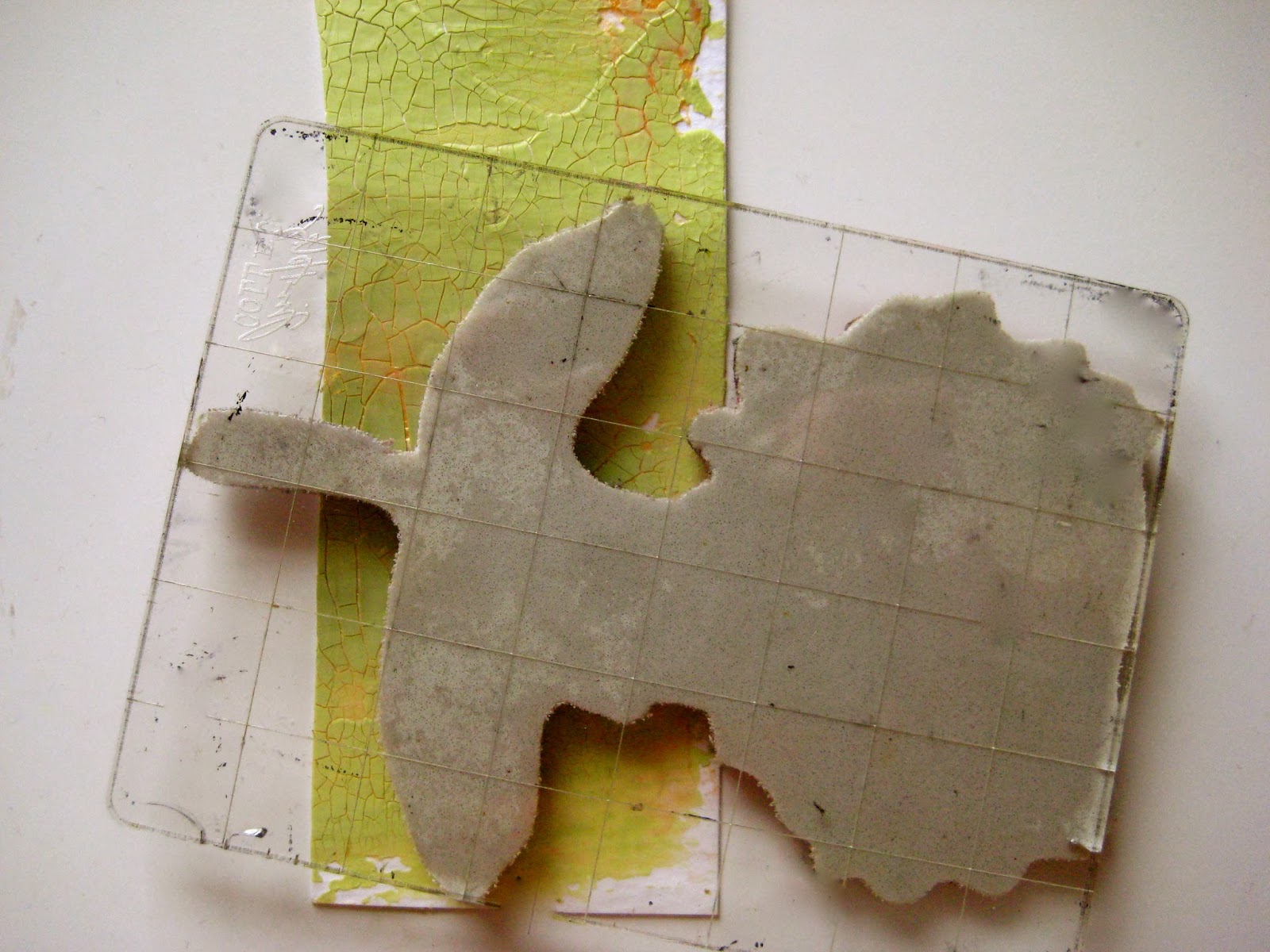
ink the leaves area with jet black archival, stamp & dry...

oops…forgot a photo, but I used the perfect peony stamp with jet black archival & stamped it onto the dry blue paste…
then cut out both pieces...

next I used fern green archival to add some shading to the leaves…with the handy dandy adorable mini blending tool…
I like to use the leaves upside down with this flower...

that little bit of shading does make a difference!

the flower needed shading too, so I added a bit of cornflower blue on the lower petals...

& it looks like this...

ok…now to make a card…
I had a strip of manila card stock leftover from something, so I wanted to use it up…
it's 10 ¼ inches x 3 ½ inches…
I scored it & folded it in half to create a card...
I used the new tree branch archival to stamp this frame…
then sprinkled clear superfine detail embossing powder over the frame & heated it to melt the powder & emboss the image…
tree branch is a GREAT color…it's neutral & looks good with most colors…

this was interesting…
when clear embossed, tree branch looks sort of a vintage gold color on the manila cardstock…hmmm…didn't expect that!
to add color to the card, I swiped weathered wood and antique linen distress stains onto the craft sheet, misted them with water, then plopped the card front in the fluid & dried it…
so far...

next decision before I choose a sentiment...
did I want the card to be side opening?

or plan B…
to open from the top?
either would work...

I stamped the sentiment with jet black archival
and I liked fern green archival for the mini flourishes...

it was easy to add subtle stripes to the background with the yikes stripes stencil and antique linen distress ink on the blending tool…
it's best to tape the stripes stencil down to hold it in place & work WITH the stripes, not against them...

now…it's much better!

next, I glued the leaves in place (upside down from the stamp)
then added the flower…
I like it & I almost quit there...

but I spotted my new vintage doily background stamp…
I used fern green to stamp a portion of the stamp on a manila scrap & cut it out...

then added it to the top back of the card…

here's a better look at the flower with the gold cracks…
it's a very cool effect…
when the crackled texture paste is applied unevenly to the surface, you'll see more random areas of the base color…I like that…it adds interest & it's not so perfect...

now I'm thinking the sentiment will work for Valentine's Day…
I think I'll give it to you know who…and write a message inside...
well I hope I've given you the scoop on playing with pastes…
if there's something I missed, just ask…
I have LOTS more to share…
LOTS more paste ideas brewing...
I think this technique is a good example on how to use the pastes without using a stencil…
wouldn't a whole crackled texture paste sheet make a great background?
this technique will also work on a canvas…think HOME DECOR!
there are lots of cool color combos to try too...
how about potting soil archival reinker mixed into the crackled paste & applied over gold embossing paste?
the silver paste also looks great as a base for the blue paste & lots of the other colors too…
these crackled sheets can also be die cut…oh the possibilities!
I hope you'll get out your pastes & play then...
make art!
wendy
ps…the pastes (all 6 flavors) are shipping…so no long wait!
new stamps and new stencils are also shipping…check your local store or favorite on line…
SiSis and the art parts binders will be shipping in a few weeks…
new inks ship the end of the month…yippee!
wait!!! one more thing…
we still have 3 unclaimed prizes…
we'll give them until Monday morning to claim them…if they don't contact us, Rick will redraw 3 names…


